
Civic
Civic
Identity Verification & Authentication Platform
Identity Verification & Authentication Platform
Identity Verification & Authentication Platform
Civic is a digital identity company offering tools for authentication, identity verification, and secure access control across decentralized and traditional applications. I was responsible for the UX/UI design of the new Civic website, working on a complete redesign that would reflect the company’s updated product strategy and appeal to a highly technical, Web3-savvy audience while remaining accessible to developers and product teams in the broader tech ecosystem.
This project stems from a thesis research on the use of gamification as a playful methodology to enhance the digital reading experience within the manga reader niche. The objective was to design a gamified manga reading app that fosters social interaction, increases reading motivation, and promotes community building.


Role
UX/UI Design, User Research, Visual Design
Duration
2 months
Tools
Figma, Illustrator, Photoshop
Problem Statement
Before the redesign, the Civic website lacked clarity in both structure and messaging. While the product itself was technically solid, the website did not clearly explain how it worked, who it was for, or how it could be implemented. Visitors often left without a clear understanding of the offering, and the navigation felt disconnected from the actual user journey. There was also a visual inconsistency between the site and Civic’s product UI, weakening the overall brand experience. The redesign had to solve these issues by aligning structure, content, and visual identity with Civic’s technical sophistication and its user base’s expectations.
Goals
The main objective was to design a website that clearly communicates Civic’s value proposition: secure, privacy-respecting identity tools for digital platforms. The new site needed to streamline the user journey for developers and partners, making it easier to understand the use cases, explore product documentation, and start integrating Civic Auth or Civic Pass. From a design perspective, the goal was to modernize the look and feel while remaining functional and fast, with a modular structure that could support new content and features over time.
Research and Benchmarking
Research and Benchmarking
I started with a landscape review of digital identity and authentication platforms—both Web2 and Web3—looking at how players like Auth0, Worldcoin, and ENS structure their product narratives. I also analyzed developer-focused sites like Stripe and Alchemy to understand best practices in technical onboarding flows. Internally, I reviewed Civic’s documentation, product screens, and existing user feedback to uncover where friction and confusion typically occurred. This helped me identify content gaps and usability issues that the redesign would need to address.
I started with a landscape review of digital identity and authentication platforms—both Web2 and Web3—looking at how players like Auth0, Worldcoin, and ENS structure their product narratives. I also analyzed developer-focused sites like Stripe and Alchemy to understand best practices in technical onboarding flows. Internally, I reviewed Civic’s documentation, product screens, and existing user feedback to uncover where friction and confusion typically occurred. This helped me identify content gaps and usability issues that the redesign would need to address.
User personas & journeys
User personas & journeys
The website had two primary audiences: developers looking to integrate Civic’s tools into their dApps or platforms, and partners or teams evaluating Civic as a provider for identity infrastructure. For developers, the journey began with understanding what Civic Auth or Civic Pass could do, followed by technical documentation or API access. For decision-makers, the priority was understanding value, compliance, and differentiation. The structure of the site was designed to support both: fast access to technical content and clear storytelling around trust, privacy, and usability.
The website had two primary audiences: developers looking to integrate Civic’s tools into their dApps or platforms, and partners or teams evaluating Civic as a provider for identity infrastructure. For developers, the journey began with understanding what Civic Auth or Civic Pass could do, followed by technical documentation or API access. For decision-makers, the priority was understanding value, compliance, and differentiation. The structure of the site was designed to support both: fast access to technical content and clear storytelling around trust, privacy, and usability.
UI design
UI design
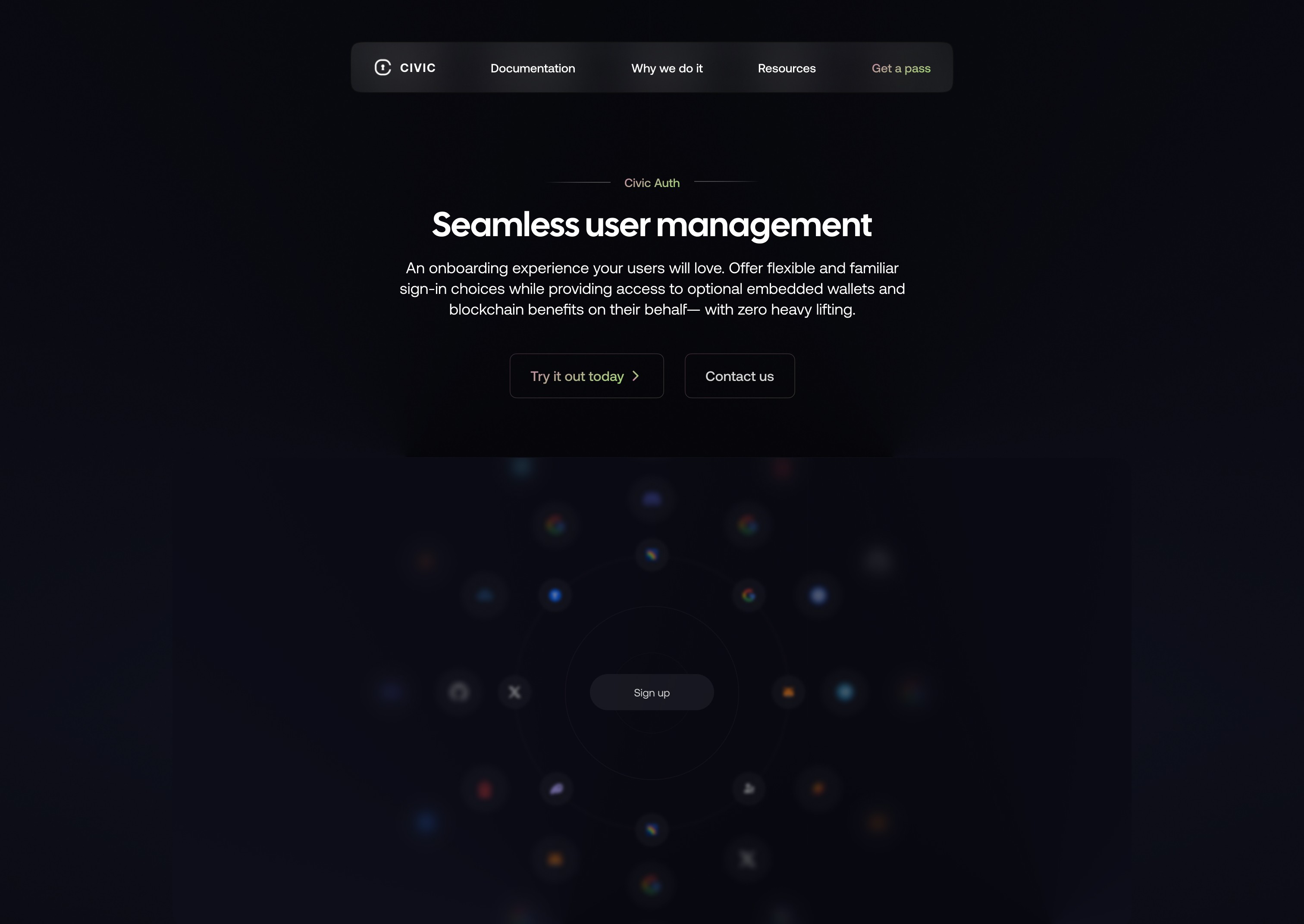
The final UI brought clarity and edge. I leaned into a dark theme with subtle gradients and sharp contrast, evoking the high-security, privacy-first nature of Civic’s product. Typography was carefully chosen to balance tech-forward credibility with readability, and visual elements like animated icons and micro-interactions were added to give the site dynamism without overwhelming the content. All components were built with scalability in mind, allowing Civic’s team to create new pages or sections without disrupting the visual consistency.
The final UI brought clarity and edge. I leaned into a dark theme with subtle gradients and sharp contrast, evoking the high-security, privacy-first nature of Civic’s product. Typography was carefully chosen to balance tech-forward credibility with readability, and visual elements like animated icons and micro-interactions were added to give the site dynamism without overwhelming the content. All components were built with scalability in mind, allowing Civic’s team to create new pages or sections without disrupting the visual consistency.


Key learnings and reflections
Key learnings and reflections
Designing Civic’s website challenged me to communicate complex, decentralized technology in a clear and actionable way. It reinforced the value of modular thinking in web design, especially for fast-evolving tech products. I also deepened my understanding of how to structure content for dual audiences—technical and strategic—without compromising clarity or focus. Most importantly, the project showed me how brand perception is shaped not just by visual polish, but by the precision with which information is delivered, step by step.
Designing Civic’s website challenged me to communicate complex, decentralized technology in a clear and actionable way. It reinforced the value of modular thinking in web design, especially for fast-evolving tech products. I also deepened my understanding of how to structure content for dual audiences—technical and strategic—without compromising clarity or focus. Most importantly, the project showed me how brand perception is shaped not just by visual polish, but by the precision with which information is delivered, step by step.
Result
Result
The final site includes a dynamic homepage, focused product pages, and clear calls to action that adapt to the user's intent—whether it’s reading documentation, booking a demo, or exploring integration flows. Microinteractions were used subtly to guide attention, and the overall structure was designed for performance and responsiveness across devices.
The final site includes a dynamic homepage, focused product pages, and clear calls to action that adapt to the user's intent—whether it’s reading documentation, booking a demo, or exploring integration flows. Microinteractions were used subtly to guide attention, and the overall structure was designed for performance and responsiveness across devices.