
Jomely
Jomely
A Human-Centered Real Estate Platform
A Human-Centered Real Estate Platform
A Human-Centered Real Estate Platform
Jomely is a real estate and rental platform designed from the ground up with a human-centered approach. The goal was to create a seamless, transparent, and emotionally supportive experience for people navigating the high-stress processes of finding, renting, or listing properties. This 4-month project involved end-to-end UX/UI design, from research to final high-fidelity prototype.
This project stems from a thesis research on the use of gamification as a playful methodology to enhance the digital reading experience within the manga reader niche. The objective was to design a gamified manga reading app that fosters social interaction, increases reading motivation, and promotes community building.


Role
UX/UI Design, User Research, Wireframing, Visual Design, Design System
Duration
4 months
Tools
Figma, Illustrator, Photoshop
Problem Statement
In many Latin American countries, the real estate process is chaotic, time-consuming, and often opaque. Users struggle with outdated platforms cluttered with irrelevant information, confusing navigation, or listings that hide fees and critical details. On the other end, property owners and agents face inefficient publishing tools, lack of user support, and limited visibility for their listings. There was a clear opportunity to reimagine the experience with a platform that values trust, transparency, and usability.
Create a digital product that simplifies the rental and purchase journey.
Build trust between users and property owners.
Prioritize clarity, empathy, and control across the experience.
Offer intuitive search and filtering mechanisms for both renters and buyers.
Research and Benchmarking
Research and Benchmarking
The research phase involved competitive analysis of global and regional platforms, usability heuristics, and informal interviews with renters, buyers, and small-scale landlords. A recurring insight was that people didn’t trust most platforms—not because of their content, but because of how that content was presented. Vague pricing, missing details, and overwhelming interfaces led users to abandon searches or default to informal channels like Facebook groups. Another key finding was the lack of post-contact tools: many users found it exhausting to coordinate visits, negotiate terms, or track interactions with agents once they sent a message.
The research phase involved competitive analysis of global and regional platforms, usability heuristics, and informal interviews with renters, buyers, and small-scale landlords. A recurring insight was that people didn’t trust most platforms—not because of their content, but because of how that content was presented. Vague pricing, missing details, and overwhelming interfaces led users to abandon searches or default to informal channels like Facebook groups. Another key finding was the lack of post-contact tools: many users found it exhausting to coordinate visits, negotiate terms, or track interactions with agents once they sent a message.


Users and Profiles
Users and Profiles
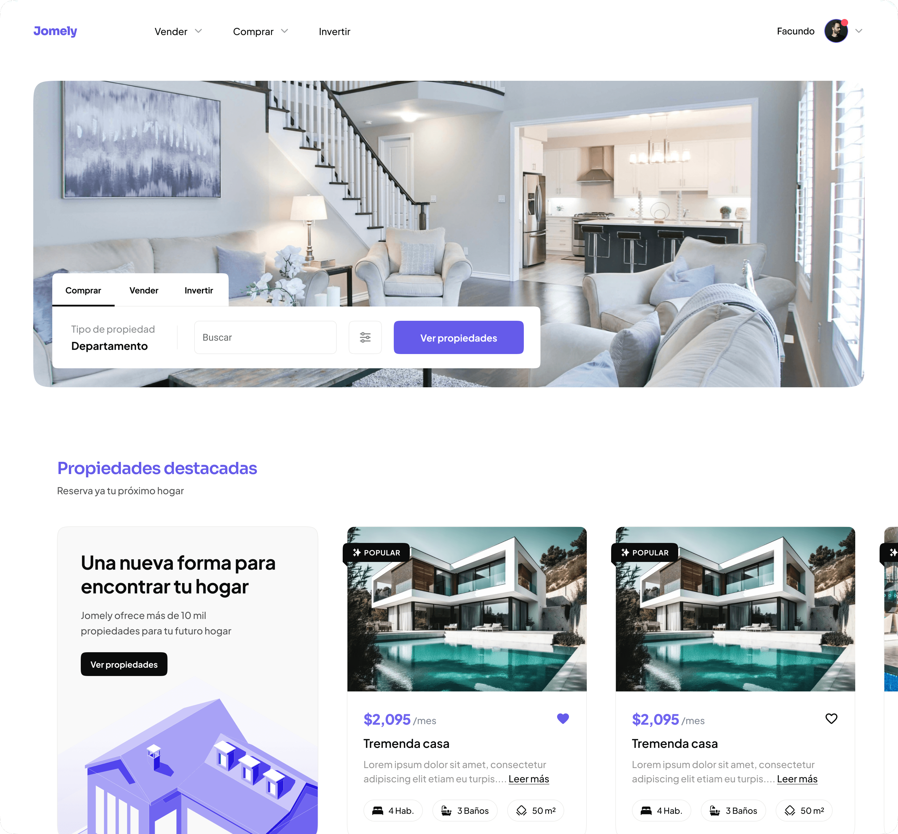
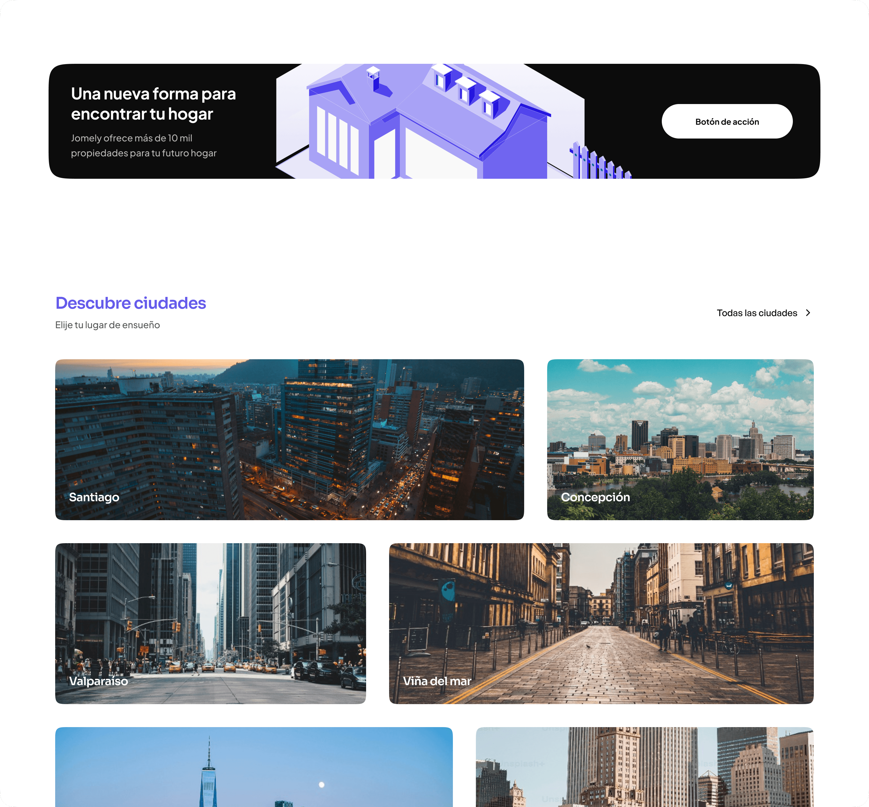
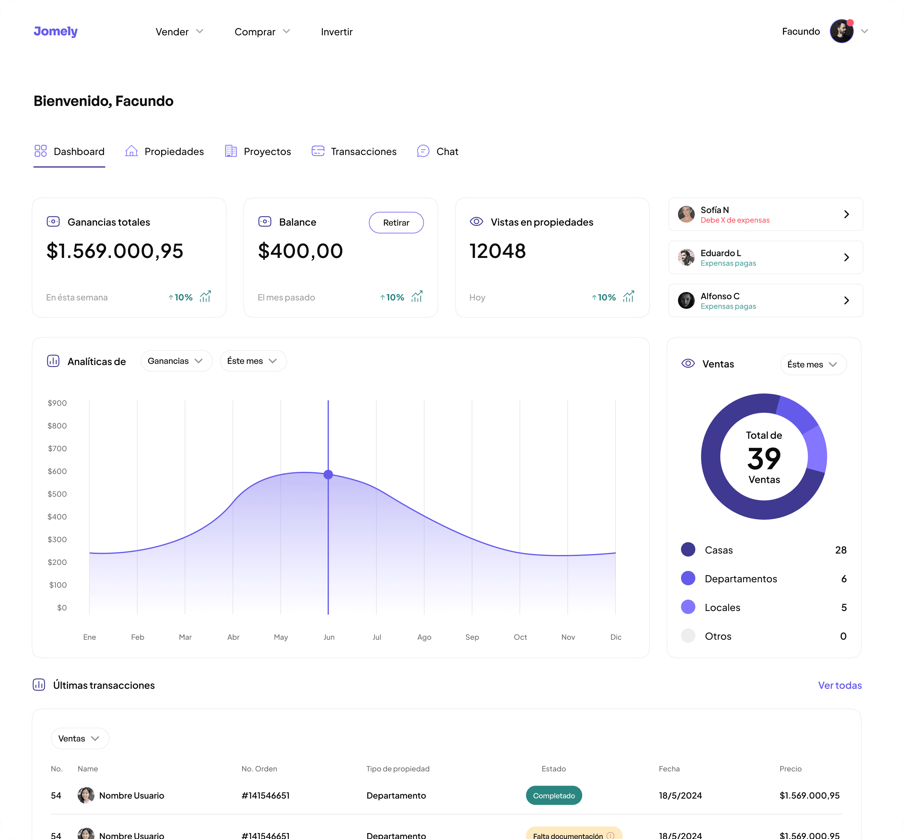
The product structure was built around two core user journeys: discovering a property, and listing one. From the start, I prioritized a minimal, content-first interface that emphasizes photos, pricing, and location at a glance. Advanced filters were included but visually hidden until needed, avoiding cognitive overload. For the listing flow, I designed a multi-step process broken into clear, actionable sections: basic info, location, images, features, and pricing. Throughout the platform, microcopy and progressive disclosure were used to guide users and reduce friction.
I also worked on the creation of a modular design system, including scalable components, iconography, and a color palette designed to evoke trust, calmness, and professionalism. The UI balances neutrality with a touch of warmth, making it accessible to both tech-savvy users and those unfamiliar with digital platforms.


Value Proposition
Value Proposition
A manga reading app that combines:
Optimized digital reading experience (dark mode, layout options, visual accessibility)
Gamification of key actions (reading, commenting, participating, recommending)
Customizable avatar using earned points
Public bookshelf with unlockable decorative items
Events, challenges, and weekly leaderboards
Implemented Mechanics:
» Points awarded for actions (reading, participating in forums, user gifting)
» Missions tailored to user profiles (achiever, socializer, killer, explorer)
» Unlockable exclusive content
» Weekly limited-time challenges and rewards
» Badges for key milestones
» Rankings and honorifics
Avatar Personalization: The avatar reflects user progress and community identity. Accessories inspired by manga characters, tattoos, backgrounds, and objects can be earned and equipped in the user’s profile and bookshelf.


UX/UI Design
UX/UI Design
The interface was designed to convey trust, clarity, and ease. I developed a neutral yet modern visual language: a light background with soft contrasts, clean typography, and strong visual anchors like cards and image galleries. Each interaction—be it saving a property, sending a message, or adding a listing—was designed to feel smooth, fast, and meaningful. The UI system includes reusable components, responsive layouts, and dark mode support for mobile.
The interface was designed to convey trust, clarity, and ease. I developed a neutral yet modern visual language: a light background with soft contrasts, clean typography, and strong visual anchors like cards and image galleries. Each interaction—be it saving a property, sending a message, or adding a listing—was designed to feel smooth, fast, and meaningful. The UI system includes reusable components, responsive layouts, and dark mode support for mobile.


Results & Final reflections
Results & Final reflections
This project helped me strengthen my process for building two-sided platforms with distinct yet overlapping needs. It also pushed me to be extremely deliberate in how information is prioritized and displayed. Designing for trust in a context as emotionally and financially significant as housing required sensitivity, simplicity, and precision. If developed further, Jomely could integrate features like appointment scheduling, in-app chat, or identity verification—each one reinforcing the user’s sense of safety and control.
This project helped me strengthen my process for building two-sided platforms with distinct yet overlapping needs. It also pushed me to be extremely deliberate in how information is prioritized and displayed. Designing for trust in a context as emotionally and financially significant as housing required sensitivity, simplicity, and precision. If developed further, Jomely could integrate features like appointment scheduling, in-app chat, or identity verification—each one reinforcing the user’s sense of safety and control.