
Sancho
Sancho
Investor Relationship Platform
Investor Relationship Platform
Investor Relationship Platform
Sancho is a digital platform that connects investors with their active and past investments, providing a centralized and clear overview of portfolios and opportunities. Initially conceived as a tailored solution for KOI, a venture investment firm, the platform was designed with scalability in mind—enabling future modules such as a public marketplace or deal flow hub. My role focused on improving the existing product experience by redesigning its UX/UI and branding, with the ultimate goal of building a coherent and extensible design system capable of supporting a complex, evolving product.
This project stems from a thesis research on the use of gamification as a playful methodology to enhance the digital reading experience within the manga reader niche. The objective was to design a gamified manga reading app that fosters social interaction, increases reading motivation, and promotes community building.

Role
Visual Design, UI Design
Duration
3 weeks
Tools
Figma
Problem Statement
Sancho was already a live platform with real user activity, but its interaction model and visual identity were inconsistent and lacked hierarchy. Users—mostly investors and internal teams—faced confusion when navigating between investments, companies, documents, and reports. The platform had grown rapidly, but the user experience had not kept pace. There was a clear need to reorganize the interface, clarify the content structure, and create a visual language that matched the professional, high-trust nature of the investment space. At the same time, the brand lacked personality and consistency, which limited its perceived value.
Goals
The main objective was to improve the clarity, usability, and visual consistency of the platform, ensuring that users could easily track investments, understand performance, and access relevant materials. From a UX standpoint, the redesign had to reduce cognitive load, align navigation with actual user flows, and create a sense of continuity across features. From a UI and branding perspective, the goal was to establish a strong visual identity and build a comprehensive design system to support both the current product and upcoming expansions, including potential marketplace functionalities.
Research and Benchmarking
Research and Benchmarking
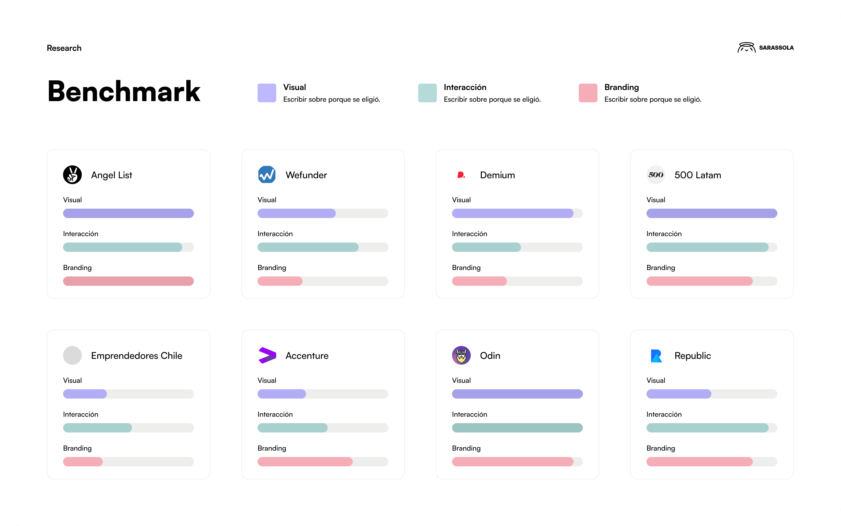
The research process included a detailed benchmarking study of leading platforms in the investment and venture capital space, such as AngelList, Wefunder, Demium, 500 LatAm, Emprendedores Chile, Accenture Ventures, Odin Ventures, and Republic Ventures. Each platform was analyzed for information architecture, user journey, branding tone, and modularity. I also interviewed internal stakeholders at KOI to better understand the real-world challenges of managing investor relations at scale. This helped define the core user needs: speed, reliability, transparency, and a clean interface that could scale with data complexity.
The research process included a detailed benchmarking study of leading platforms in the investment and venture capital space, such as AngelList, Wefunder, Demium, 500 LatAm, Emprendedores Chile, Accenture Ventures, Odin Ventures, and Republic Ventures. Each platform was analyzed for information architecture, user journey, branding tone, and modularity. I also interviewed internal stakeholders at KOI to better understand the real-world challenges of managing investor relations at scale. This helped define the core user needs: speed, reliability, transparency, and a clean interface that could scale with data complexity.

User personas & journeys
User personas & journeys
Sancho primarily serves two types of users: investors who need a high-level view of their portfolio, and KOI’s internal team who manages investment updates and stakeholder communications. Investors want to see portfolio performance, track communications, and access documents with minimal effort. Meanwhile, KOI needs a backend interface to manage updates and structure the flow of information. These user needs were mapped into specific journeys—dashboards, company views, reporting modules, and notification flows—each informing the layout and interaction decisions throughout the redesign.
Sancho primarily serves two types of users: investors who need a high-level view of their portfolio, and KOI’s internal team who manages investment updates and stakeholder communications. Investors want to see portfolio performance, track communications, and access documents with minimal effort. Meanwhile, KOI needs a backend interface to manage updates and structure the flow of information. These user needs were mapped into specific journeys—dashboards, company views, reporting modules, and notification flows—each informing the layout and interaction decisions throughout the redesign.
Key learnings and reflections
Key learnings and reflections
Designing for an already-active platform presented a unique challenge: balancing respect for existing user habits with the need to evolve the experience. This project pushed me to focus deeply on clarity, scalability, and structural harmony. Building a design system for Sancho meant designing for now and for what’s coming—ensuring that new features like a future investment marketplace could be integrated smoothly without breaking the experience. It also reminded me that in data-heavy products, less is often more when it's organized with intention.
Designing for an already-active platform presented a unique challenge: balancing respect for existing user habits with the need to evolve the experience. This project pushed me to focus deeply on clarity, scalability, and structural harmony. Building a design system for Sancho meant designing for now and for what’s coming—ensuring that new features like a future investment marketplace could be integrated smoothly without breaking the experience. It also reminded me that in data-heavy products, less is often more when it's organized with intention.